Designing a Tablet-Based Shopping Assistant for Summit School Students
Introduction
Introduction to problem (pwd: iShop)
Summit’s Existing Strategies to Foster Shopping Skills
- Math classes are put in real world context (e.g. Practising arithmetic would involve adding up the prices of several food items. Those might be expanded to full simulations where an instructor acts as a cashier).
- Some students are taught the Next Dollar Approach, which is a rounding strategy to make calculation and counting simpler.
- Every second Tuesday, students take class outings to nearby grocery stores or cafes and utilize the skills learned in class, with an instructor present for support.
- Technology Often Used in Classroom, facilitating familiarity with tablets and touch screen interfaces -> May generalize to an app
Initial Guidelines and Requirements Provided by Summit
- The app should allow a user to input the contents of their wallet.
- Show realistic images of each bill (no cartoons or drawings).
- Only use loonies or larger denominations of money.
- Multiple bills should be shown as separate images.
- The app should allow a user to input items they wish to purchase.
- The total amount has to be shown, with a circular diagram representing the portion of funds used and whether the user has enough to complete their purchase.
- The app should display the combination of bills required for a user to complete their
purchase:
- This has to account for taxes, however taxes are problematic because they differ
with location and some items are non-taxable.
- The app should work on iPhones and iPads
- Portrait and Landscape mode both have to be supported.
- Anytime an amount is shown, the number should always end with a decimal point followed by two digits even if the amount is a whole number. This tends to be more familiar to students.
- The option to add tips is desired.
- The app should not display the amount of change to expect; because it may not be correct (given taxes).
- The app should be as visually intuitive as possible
- Some administrator settings may also be desired to manage optional features or
languages
The Design
Using the above information, we determined the following general overview of a user’s experience with the app. That overview has prevailed for all prototypes of the product.
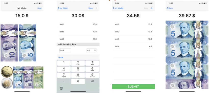
Wallet: Before going to the store, users can match the money in their wallet to pictures on the screen. They select what coins and bills they have, populating a virtual wallet.
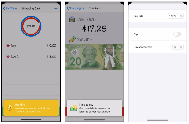
Shopping Cart: When at the store, users enter the prices of every item they put in their cart. iShop accounts for tax and tracks how many purchases can be made before the user runs out of money.
Payment: iShop determines which bills are needed to pay for all items, displaying each one on the screen.
Prototype #1 (Conceptual, Paper Only)

Wallet Screen (slide 2 & 3): There are two main areas. The wallet zone, above, and the matching zone, below. A student would match a bill or coin from their real wallet to the corresponding button in the matching zone, and click it. This would generate an image of that bill or coin in the wallet zone, and begin raising the total.
Subsequent feedback identified several targets that could be changed.
- Making the cartoon bills into pictures of real bills.
- Drag and drop vs. pressing a button.
- Words vs. Pictures
- Not having bills overlap or stack.
Shopping Screen (slide 4 & 5): As an item is placed in the cart, enter the price on the keypad at the bottom. Repeat for each item. As you accumulate items, the bills you would need pop up between the circular visual and the keypad. At the same time, the red ring grows as your shopping total is being compared to your wallet total. Once you’ve input every item, press a submit button (not shown) and go to the pay screen (not yet made).
Subsequent feedback identified several targets as well.
- The red and green are nice, but this fraction visual may not be very intuitive. A different suggestion was an orb that starts at full, empties as you enter items, then turns red if you go over your limit.
- The bills that pop up here make the screen a bit busy and probably will not contribute much. Save for the later screen.
- The bigger the buttons, the better.
- Will the total number or the visual account for tax?
Prototype #2 (Coded, semi-functional on an IPhone)
Not all feedback was addressed between Prototypes #1 and #2.
Wallet (slide 1) design notes:
- We’ll move the dollar sign to the left of the price. Also, add a second zero after the decimal.
- Secondly, we may be able to add speech selection functionality, which will allow text to speech of the total.
- Deleting bills? Swipe the bill down. We have considered an undo button but have decided against.
- Wallet screen will become lockable. So, you enter your amount before you go shopping. And even if you press the wrong thing on the shopping screen, or you gotta start your list over, the wallet amount will remain.
Shopping Cart (slides 2 & 3) design notes:
- We added labels. These are not mandatory, but for some users, this will allow for tracking which items were associated with particular prices, so if part way through you want to put an item back, you can delete it by swiping horizontally.
- We added a green submit button in order to move on to the payment screen.
- The circular display is not present because it was not yet coded.
Payment screen (slide 4): This includes the total with taxes, that will hopefully be the same as the cashier’s till. That may not always be the case, because some items may not have tax, like produce. However, in every situation, the number on the app should be higher. Overpaying is okay, underpaying is where problems come out.
The bills shown below the total should be the bills a user takes out and gives to the cashier.
These bills could be arranged by either the least amount of bills you could give, or the collection of bills that give the least amount of change.
For example, if something cost 31 dollars, and you had 2 20’s, 1 10, and a loonie. You could either give two 20’s (few bills), or, a 20, a 10, and a loonie, and not worry about change at all.
Once the user has paid, the user can press a button to exit, which will notify them that they are finished, and the app will reset to the wallet screen automatically.
Other Design Decisions
Administrator Settings:
Some of our design decisions cater to a particular level of cognitive functioning. The more we make customizable, the more users could potentially benefit from this app.
Prompting:
This speaks to “what comes next?” For example, in between the shopping screen and the payment screen, would we want an audio clip or a picture to say, “now take these bills from your wallet. Then, walk to the cashier’s till.”
We decided against audio, leaving only visual prompts. Audio may be an easier medium to convey a prompt for many students, but it may also be undesired because it draws attention, or the sound is socially undesired.
The Solution
Due to the global pandemic, COVID-19, the testing phase for iShop (with Summit students) was cancelled. In response, the team opted to focus on sustainability of the technology, by creating a marketing plan as well as instruction manuals and videos. It is currently uncertain when or if a testing phase could be introduced.
Regarding our marketing plan, we initially considered creating several social media posts and templates to spread awareness about the app. However, it was eventually struck down, because social media typically requires someone to manage an account indefinitely. This could not be guaranteed. We will still create a Facebook support page for the app. Our focus, however, will be towards a PDF pamphlet. These can be distributed over email and printed out for display by various offices, non-profits, schools, or clinics. Our partnership with Summit School can provide a larger network of interested parties and organizations. We can also seek out partnerships with McGill related organizations in the future.
At the time of writing, the pandemic has prevented the production of an instructional video for users. When social restrictions have been lifted, it is our intention to create a short, narrative video demonstrating a person using iShop when going to the store. This video will use a cognitive-behavioural therapy framework, using modelling strategies and context specific lessons to facilitate learning. In the meantime, an instruction manual has been created.
**Design Specifications will be discussed with the development team**
The “End” Product

Slide 1: Wallet Screen Slide 2: Shopping Cart Screen Slide 3: Shopping Cart Screen Slide 4: Shopping Cart Slide 5: Payment Screen Slide 6: Administrator Settings


Intro Screen App Logo